Monday, July 8, 2013

A Capitol Fourth (plus the weekend)

Our Independence Day holiday started Wednesday evening by going to the dress rehearsal of the annual concert given on the steps of the Capitol building.  Neil Diamond and Barry Manilow performed, along with a 13 year old girl from America's Got Talent, a sort of country guy from American Idol (I think?), some kid from Glee, and two performers from the Broadway musical "Motown."  It was good, though I did think there would be more patriotic music performed.

At the Capitol Fourth dress rehearsal

Thursday, we visited the Holocaust Museum. Amazing!  We spent two hours there and didn't get wiped out or overly tired because of it.  And it really made us appreciate our freedom and liberties.  That evening we watched the city fireworks from the balcony of a building that another intern works in.

On Friday, a long-awaited date occurred: paddle-boating in the tidal basin. It was fun! Hot and tiring since we were the powersource getting our little paddleboat to go anywhere. However, we were serenaded by a practicing choir on the steps of the Jefferson Memorial.  Later that day we went to see "Man of Steel" at the AMC theater in Georgetown.

We took a really fast picture, facing the sun (which is why we're squinting); I was slightly paranoid about dropping my camera into the water...
Cody, the Jefferson memorial, and the practicing choir in the background
Saturday=day of nothingness.  We hung around the apartment building, did laundry, went grocery shopping, watched some shows, read, played air hockey and Scrabble, and talked.  I was attired in basketball shorts and my orange BYU NSO shirt all day.  It was fantastic!

Wednesday, July 3, 2013

NGA: More of the Renaissance & Baroque Pieces

I'm not really feeling up to writing a lot today, but I did want to share some of the pictures that I've taken at the National Gallery of Art that finish up the Renaissance paintings on the second floor.  I guess there are more on the first floor, according to the map, but I haven't seen them yet.

The Lute Player, Orazio Gentileschi, 1612/1620
Interior of Saint Peter's Rome, Giovanni Paolo Panini, 1754
The Repentant Magdalen, Georges de la Tour, 1640

Marchesa Elena Grimaldi Cattaneo, Sir Anthony Van Dyck, 1623
These paintings (starting with Sir Anthony Van Dyck's Marchesa Elena Grimaldi Cattaneo) are from the Flemish and Dutch Renaissance.

Detail of Marchesa Elena Grimaldi Cattaneo

A Genoese Noblewoman and Her Son, Sir Anthony Van Dyck, 1626

Bagpipe Player, Hendrick Ter Brugghen, 1624

A Pier Overlooking Dordrecht, Aelbert Cuyp, early 1640s

The Mill, Rembrandt Van Rijn, 1645/1648

Detail from The Mill

View of Hoorn, Abraham de Verwer, 1650

Young Boy in Profile, Judith Leyster, 1630

Woman Holding a Balance, Johannes Vermeer, 1664

The Girl with the Red Hat, Johannes Vermeer, 1665

A Lady Writing, Johannes Vermeer, 1665

Lucretia, Rembrandt van Rijn, 1664
The story behind this painting is neat. You should look it up.

NGA: Spanish, French, British, American 18th & 19th Century Paintings

I've almost completed the second floor of the NGA. I only have half of a wing left--the 19th Century French collection. After doing that section, then I'll just have the first floor left and then I'll be done with tackling the NGA.  Especially since renovation work will be happening in both the East and West buildings for the next three years, I really want to make sure that I take my time and see everything, because I might not have that opportunity the next time (like how the first time I came two years ago I didn't take the time to go up the Washington Monument and I can't do that this summer since they're reinforcing it; I also should have booked a White House tour two years ago since I can't go probably anymore, ever).
Soap Bubbles, Jean Simeon Chardin, 1733-1734, French
Chardin was different from other French artists at this time. Instead of the Rococo pieces you'll see after this (Fragonard and Boucher are the important names to remember from the Rococo period).  Instead of the lighter colors and cupids, Chardin used a darker palette and focused on everyday scenes of everyday people, not just the aristocracy and their frivolities.
The Love Letter, Francois Boucher, 1750, French
 Very Rococo.  My favorite part from this painting: the dog. The dog looks so great!
Detail from The Love Letter

Blindman's Bluff, Jean Honore Fragonard, 1775/1780, French
 Again, Rococo at it's best. HUGE canvas with soaring trees and sky. What's it named after? The little scene going on at the bottom and very small.
Detail from Blindman's Bluff

Wivenhoe Park, Essex, John Constable, 1816, British
 Interesting facts about this painting: Constable painted on site. He had to add on three inches to both sides of the canvas because his commissioner wanted more of the scene to be included. That is why there is a cow in the lower left and a boat in the lower right, to try to mask the seams.
The Washington Family, Edward Savage, 1790-1796, American
 This was the first informal painting of an important family.  History: George Washington married Martha Custis. Her two children grew up and had kids. Martha had four grandchildren. Her two children passed away and George decided to adopt two of the grandkids. They called her "Grandmother" and him "Papa."

Vermont Lawyer, Horace Bundy, 1841, American
 I just need you to mourn with me between the quality of Vermont Lawyer and this painting by Gilbert Stuart.  Vermont Lawyer was painted about fifty years after the Gilbert Stuart, and yet it lacks the depth, breadth, and quality of the Stuart painting. I was really disappointed by a lot of the American paintings in the 1800-1850s room.

Catherine Bras(s) Yates (Mrs. Richard Yates), Gilbert Stuart, 1793/1794, American

Brace's Rock, Eastern Point, Gloucester, Fitz Henry Lane, 1864, American
I'd like to visit here. It looks peaceful.
The Old Violin, William Michael Harnett, 1886, American
When this painting was originally on display, it had to have guards by it so that people wouldn't reach out and touch the canvas trying to see if it really was a painting.  Even still, it is behind glass so that people won't touch the canvas.

Tuesday, July 2, 2013

NGA: Outdoor Sculpture Garden

This post could be called Part Two of my adventures in Modern Art.  These are the modern art pieces that were too big to fit into the East Building of the NGA (and they're designed to be outside and not be destroyed, I guess). Here goes...
Aurora, Mark di Suvero, American, 1992-1993, steel
I'm not entirely sure what the artist was trying to do, but my initial thought was that all the letters of Aurora can be found in this piece. What do you think?
Thinker on a Rock, Barry Flanagan, British, 1997, cast bronze
Just because I took a picture of it's twin in the Hirshhorn Sculpture Garden.
Graft, Roxy Paine, American, 2008-2009, stainless steel and concrete
A graft is where two different plants come together to make a new one, right? I wonder what the graft is in this. Maybe it's the combination of using steel, a nonliving substance, to make a tree, something that is living. Whatever the reason, it's beautiful and the branches are so delicate.
Fountain in center of sculpture garden
This is an awesome fountain in the middle of this garden.  The water coming out of those pipes is like water coming out of a fire hose--incredibly powerful!  A nice relaxing place in the middle of busy Washington DC.

NGA: East Building

My only piece of advice if you are either 1) Rusty on your art history movements since Impressionism, 2) Not knowledgeable at all about anything with modern art, or 3) Want a docent's perspective, is to definitely go on a tour!  The docent for my tour of the East Building (containing works from Impressionism on to the present) walked us through the history of the building, of each art period and how they progressed and why, some advice on how to approach the art in each movement, and she was really nice.  I felt a lot more confident after that tour to be able to say, "I can appreciate modern art," instead of the bewildered feeling that might have ensued or the thought, "My almost-15-month-old nephew could do that."

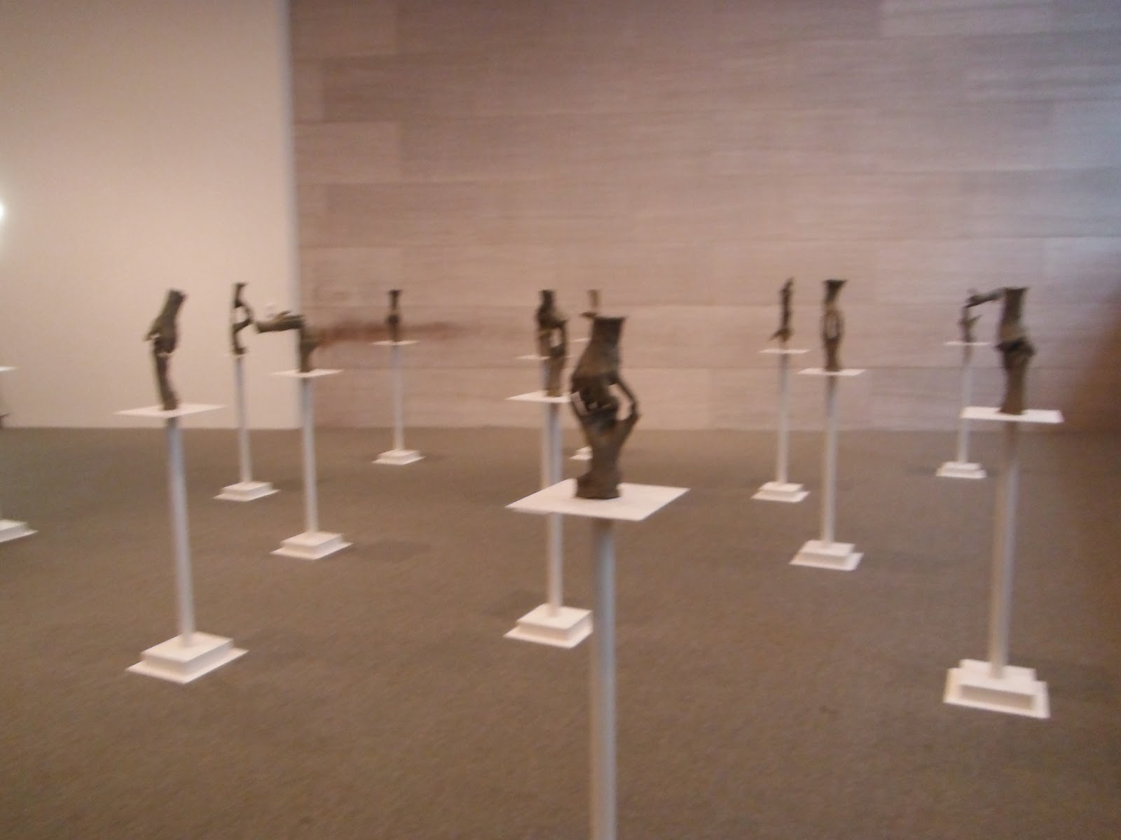
Fifteen Pairs of Hands, Bruce Nauman, American, 1996, white bronze with painted steel bases
Just like with when I visited Rodin's home in Paris, I took a lot of photos of the hand sculptures, I couldn't resist here either. I love sculptures or bronze casts of hands. Even with paintings, I always look at how the artist depicted the hands. 
Part of Fifteen Pairs of Hands
I liked this sculpture because it reminded me of how Cody and I hold hands sometimes.
Part of Fifteen Pairs of Hands
This one has both of them saying, "I love you" with sign language, which is really cute.
Part of Fifteen Pairs of Hands
This one is just cool. I love how much they both look like they are floating.
Synecdoche, Byron Kim, American, 1961-present, oil and wax on wood
This was the last piece that the docent showed us on our tour.  Her first question was, "What do these colors remind you of?" All of us mentioned skin tones. And that is what they are!  The artist started this piece in 1961 by going out and matching his oils to people's skin tones.  Not only does he just match it and paint a block of wood (as shown), he keeps track of which block goes with which person. There was a diagram off to the side of this piece that showed every person's name in order by first name that is in this piece. Isn't the diversity amazing? Yet at the same time, it's just monochromatic.
Beasts of the Sea, Henri Matisse, 1950, paper collage on canvas
I mostly got these next few pictures for use in my class this next year. I thought doing some paper collages would be fun, especially if they can see that it really is real art, not just an arts-and-crafts activity at summer camp.

I also wanted my students to see the scale of this paper collage piece by Matisse. Talk about HUGE!

Cow, Alexander Calder, American, 1929, brass and copper wire

This is for my students.  It's a cow made out of wire. There was a quote by Calder saying that by using wire he is able to create 3-D creations that look like a 2-D design. I'm still thinking about how I can incorporate this idea into a class art project, but it would be really fun, however I'm able to do it.

Tableau No. IV; Lozenge Composition with Red, Gray, Blue, Yellow, and Black,  Piet Mondrian, 1924-1925, oil on canvas
Okay, okay, the infamous Piet Mondrian whose only "claim to fame" is that he can paint rectangles, squares, and lines, right? Actually no.  That isn't really why he is famous.  He's famous because he can completely flatten out the colors. Instead of the warmer colors popping out at you (i.e. the red and yellow), they are seen on the same level as the cooler colors (blue, gray).  It's because of the varying widths of the black lines that Mondrian is able to do this. When the docent explained this, my opinion of Mondrian went from, "Why is this even in here?" to "That really is a big deal that he could do that." The docent also informed our group that Mondrian's work really influenced architecture and that modern architecture is what it is now because of Modrian. He streamlined it--no more curlicues and grotesques--just the lines.

Piano mecanique, Joan Mitchell, 1958, oil on canvas
Here it is. The painting my nephew would make if only my sister let him have access to paint.  It's also a visual image of what a mechanical piano sounds like to this artist.  And look at the lower painting detail--look at how thick that paint is! That's all I'm going to say about this one; you can think about it yourself.
Detail from Piano mecanique

Monday, July 1, 2013

NGA: Italian, French, & Spanish Renaissance

Last week I began the monumental journey of exploring the National Gallery of Art (NGA) in Washington D.C.  If anyone has ever visited (like I pretended to do two years ago), if you don't know what to expect, it is overwhelming.  In the West Building, in particular, there are so many different paintings and interconnected rooms and movements and styles that it is easy to get turned around, over-saturated, and sick of looking at art very quickly.  That was my experience two years ago.

This time, I decided I would take  my time, take two or three weeks if need be with only 1.5-3 hours max at the gallery any day I decided to go.  It has made a huge difference in my ability to want to keep visiting, to remembering the things I learned while visiting, and to not create a huge headache.  I originally planned on taking a person-led tour everyday but on my first day in the West Building (which is art up until the Impressionists/Post-Impressionists), the tour guide couldn't make it for the introductory tour I'd planned on going to, so instead I changed my plan and switched to doing the self-guided audio-tours.  I've loved doing them!  The people at the audio tour desk now recognize me. I will be devoting several blog posts to the different sections in the National Gallery of Art, including the East Building and the Sculpture Garden.

Italian, French, and Spanish Renaissance

Madonna and Child in a Landscape, Giovanni Bellini, 1480/1485
This is one of Bellini's earlier paintings.  It depicts a rather chubby baby Jesus, with a solemn Mary looking down. I love the landscape in the background, especially the clouds.  There isn't a lot of emotion, though he is able to portray his subjects well, and unlike earlier medieval paintings, baby Jesus looks like a baby, not a miniature adult.
Portrait of a Venetian Gentleman, Giovanni Bellini, 1500
In this painting about 15-20 years later, Bellini just did a portrait, another commission request (besides Madonnas) that was on the rise.   This man's face shape is very similar to the Madonna of twenty years before, but I feel that even though there isn't a lot of emotion, this man has more visible character than is evidenced in the Madonna painting.  This painting was quite small, with not a lot of variety in the palette used.
The Feast of the Gods, Giovanni Bellini and Titian, 1514/1529
And then WHAMMO!  Skip forward another 15 years for Bellini, and this is what he's being asked to paint. Not a Madonna (though those were continuing to be painted during the Renaissance) and not a portrait (though those two were still commissioned), but a flashback to antiquity with the Greek gods hanging out drinking wine.  Bellini uses a much larger variety of colors and seems to make more of a study on the human figures than he had in his other two paintings.   There is a lot more action in this painting among the figures, with a lot of little stories going on. Originally there wasn't a large forest to the upper right; Titian added that.
Detail from The Feast of the Gods
Madonna and Child with the Infant Saint John, attributed to Fernand Yanez de la Almedina, 1505
I wanted to focus on the differences between this version of Madonna and Child with St. John. They were only painted five years apart, by different artists.  The artists used similar colors for the clothing of the Holy Family, based on years of symbolism. I like how both artists were able to show the difference of 6 months age in the two boys. As I've observed my nephew growing this past year, the physical and cognitive between him six months ago and now are amazing, and I feel like both of these artists were able to show that difference between the cousins. I love the softness in Mary's face in both paintings.  All in all, I think I like the Mary from the Almedina painting and the two boys from Raphael's painting.  I also like that Raphael's painting is on a circular canvas, which adds to the intimacy of the scene, I think.  These two Madonnnas are so different from Bellini's; what a difference the Renaissance made.

The Alba Madonna, Raphael, 1510
While I also viewed pieces from the French and Spanish lines, I didn't take any pictures. If you're interested in any, go here for French Renaissance Art (I didn't see any of these at the NGA) and here for Spanish Renaissance Art (I saw El Greco's Laocoon and some of his other pieces).
Related Posts Plugin for WordPress, Blogger...